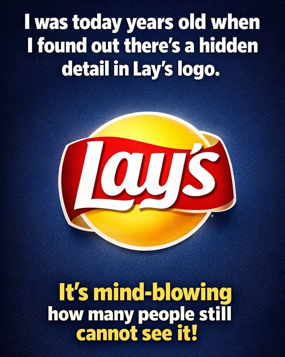
That familiar Lay’s “sun” isn’t just a cute backdrop for the wordmark; it’s a softened twin of the golden orb in the Frito-Lay logo. Same warm yellow, same curved red banner energy, just stripped down so it feels like its own thing. You’re not supposed to consciously think “Frito-Lay” when you grab a bag. You’re supposed to feel the same warmth, the same trust, the same snack-time comfort that’s been drilled into you for decades.
The psychology runs deeper than nostalgia. Yellow whispers “fresh, happy, hungry.” Red shouts “look here, crave this, buy now.” Together, they dominate the chip aisle, turning a basic potato slice into something that feels sunny, golden, and irresistibly crisp. You think you’re choosing a flavor; in reality, you’re responding to a visual language you’ve been trained to obey. Lay’s didn’t just become iconic. It was designed, very intentionally, to feel like it always belonged there.